AI Slop vs. AI Art: How to Tell the Difference
AI slop isn't hard to find. It's official: the internet is dead, and it's full of trash.
Here's how it happens. Someone gets a Claude Code subscription, types one prompt for a wildly ambitious project and ships whatever comes back. No testing. No review. The result is riddled with bugs and AI cliches, and the web fills up with more of them every day.
The tool isn't the problem. The difference between slop and something worth your time is the intelligence of the person behind the prompts.
"Hey ChatGPT, make Grand Theft Auto 6. Make no mistakes."
The "make no mistakes" part is crucial. (That's sarcasm.)
How to spot slop in writing
Overused AI vocabulary
Words like delve, leverage, navigate, elevate, intricate, meticulously, seamless, robust and game-changer. Hype phrases like "boasts a vibrant ecosystem." One of these in a page is fine. Five in a paragraph means nobody edited it.
Formulaic structures
The "It's not X, it's Y" line. The rule of three, where every point comes with exactly three examples. "Not only... but also" transitions every other sentence.
No real specifics
Vague claims with no names, dates or hard numbers. Advice so generic it fits any business or topic you paste it into.
Punctuation and formatting tells
Heavy use of the long em dash, a bolded fragment at the start of every paragraph, and bullet lists that all follow the same shape. You won't find a single em dash in this post. We checked.
How to spot slop in images and video
Glossy, over-manicured perfection
Lighting, skin and textures that look smooth, plastic or too clean. The model doesn't understand real-world physics or how shadows fall, so it polishes everything flat.
Anatomy and logic errors
Extra or melted fingers. Eyes that don't match. Objects fused together. Background details that make zero sense once you look closer.
Unnatural movement
Disembodied limbs, feet that slide across the floor, faces that flicker, and objects that morph into other shapes from one frame to the next.
Synthetic voiceovers
Flat pacing, robotic delivery and no breathing. Real people pause, speed up and take a breath. AI narrators hold the same rhythm for ten minutes straight.
Account and source red flags
Check the profile. If every post follows the same hyper-specific prompt formula (endless animals in unusual scenarios, for example), you're looking at a content farm.
How to spot slop in design
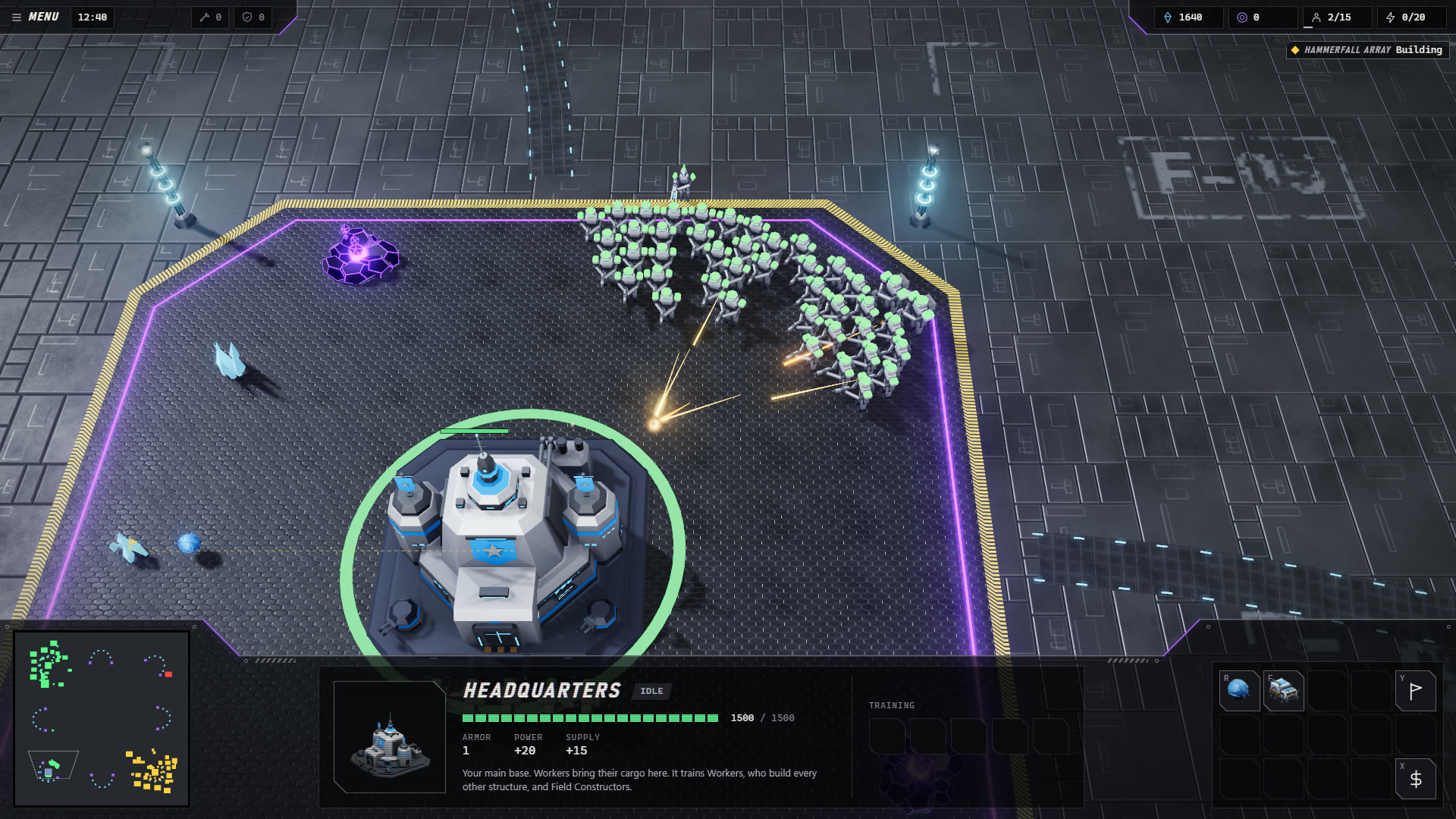
Vibe-code purple and neon glows
Blue-to-purple gradients. Dark backgrounds with glowing blobs of ambient light. Glassmorphism cards that serve no purpose.
The left-edge accent
Cards or panels with a thick, bright vertical border down the left side.
One corner radius for everything
The same rounded corner (often 16px) on every container, card, button and input, no matter how they nest.
Safe, default typography
Center-aligned Inter or a system sans-serif with oversized, tight-tracked headings. Or a sudden, unmotivated pairing with a thin editorial serif like Instrument Serif.
The formulaic SaaS hero
A centered pill badge at the top (usually with a ✨ inside), a vague two-line headline, two side-by-side buttons (one solid, one ghost) and a tilted dashboard mockup underneath. You've seen it a thousand times.
Three-column bento grids
Rows of three identical cards. A small icon in a colored square, top left. A bold title. Two lines of filler.
Emoji overdose
Raw emojis as navigation icons, inside status chips, or at the start of every bullet and card header.
Untouched component library defaults
Out-of-the-box shadcn/ui or Tailwind CSS primitives dropped on a page with no changes to spacing, borders or hover states.
How to spot slop in how it works
Happy path only
It looks polished in a screenshot. Then you hit an empty list, a slow load, an error or a long username, and the layout falls apart. Nobody designed for those cases because nobody tested them.
Placeholder copy
"Build the future of work." "Seamless workflow automation." Fake metrics like "99.9% uptime" and "10x faster," next to generic stock avatars.
Decorative noise
Fake status badges, toggle switches that don't toggle, and tiny charts stuffed into cards to make the screen look busy.
One sign isn't proof
None of these is broken on its own. A purple gradient is a color choice. A row of three cards is a layout. As designers writing on Muzli and UX Planet point out, these things turn into slop when they pile up with no human intent or brand context behind them.
One tell is a coincidence. Six on the same page is a pattern.
What good AI-assisted work looks like
Good AI-assisted work is built brick by brick, on purpose.
The person behind it knows what they want before they type anything. They don't ask for GTA 6 in one prompt. They break the project into pieces small enough to check, and they write and rewrite each prompt until it asks for exactly one thing.
Then they test it. They run the code and play the game. They click every button, try to break the form, and paste a 300-character name into the profile field to see what happens. When something's wrong, they fix the prompt or fix the code by hand.
They read every change before they keep it. The model writes a draft. A human decides what ships.
They also make the choices a model won't make on its own: a color palette that fits the project instead of the default purple, and copy with real names and numbers in it.
The tool is the same one the slop makers use. The difference is how much thinking happens between prompts.
That's what we score when we review a game here. We want to see that someone played it, found the bugs and fixed them before you did. Built something like that? Submit it.
Written by The Vibe Code Reviewer